
What Map the Meal Gap Can and Can't Tell Your County
August 11, 2026
Every year, Feeding America publishes the most-cited number in food security. Map the Meal Gap 2026 is out now, estimating food insecurity for every county, congressional district, and state in the country. If you have ever written or read a grant application in this space, you have met this study. It is where "one in seven of our neighbors" comes from.
It deserves the citations. A shared, credible yardstick that covers every county in America is enormously valuable, and this year's edition carries findings worth sitting with: roughly 48 million people experienced food insecurity in 2024, including 14 million children. The finding I would put in front of every funder is this one: nearly 25 million food-insecure people earned too much to qualify for federal nutrition assistance. If you have ever tried to explain why SNAP enrollment understates the need in your county, Map the Meal Gap just handed you the national evidence.
What the number is
It helps to be plain about what this study is, because its strengths and its limits come from the same place. Map the Meal Gap is a set of modeled estimates, built carefully from federal data sources and published annually. The 2026 edition reflects 2024 data.
That lag is not a flaw. National coverage at county resolution requires modeling, and modeling requires the underlying data to exist first. The lag is the price of the coverage, and the price is worth paying. But it does mean something worth saying out loud: the number your county cites this fall describes the year before last.
Two questions it cannot answer
Both are limits of design, not of effort. No national study could answer them.
Where within your county. A county is not one place. Need concentrates in particular corridors, particular tracts, particular crossroads, and a single county rate cannot show that. A county at 14 percent can contain neighborhoods near double that and neighborhoods where the rate is a rounding error. Every funding decision made from the county number alone treats those places as identical.
What is happening on the response side. Map the Meal Gap measures need. It says nothing about the response: who is actually serving, on what days, at what hours, with what capacity, and what has changed since 2024. Between then and the moment you read this, eligibility rules shifted, grocery prices kept moving, and pantries opened, closed, and changed their hours, mostly without telling any directory. A measure of need cannot tell a family whether they can reach help this Saturday. And it cannot tell a funder where the response is thinnest.
The yardstick and the map
Here is how I would put the new release to work:
Use the yardstick for what yardsticks do: scale, trend, and legitimacy. Map the Meal Gap establishes that the need is real, that it is large, and that it reaches past every program boundary. It is the right number for the top of a grant application and the opening slide of a board meeting.
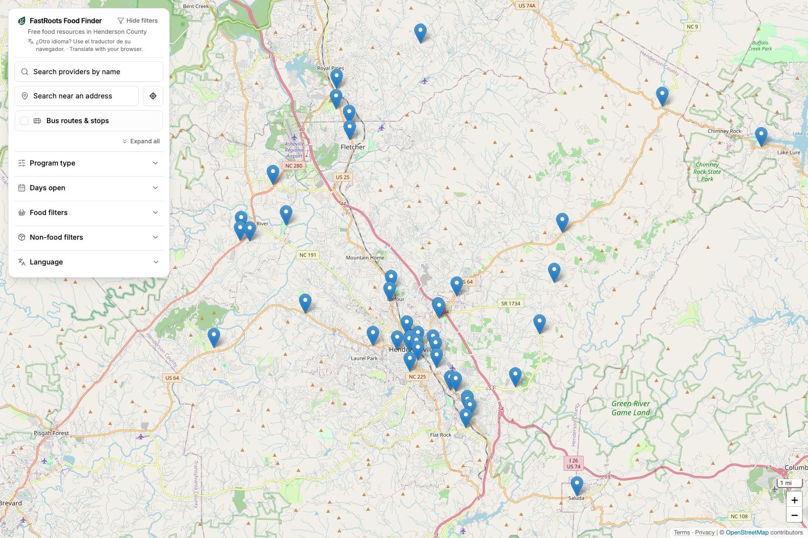
Then pair it with what a yardstick cannot be: a current, local, verified picture. Every provider in the county, confirmed as actually operating. Hours and access requirements as they are now, not as they were at the last survey. Need mapped at the tract level, where decisions actually land. When a grant application cites the county's food insecurity rate, the next question a funder should ask is a friendly one: and what does the current local picture show?
The national number and the local living picture are not competitors. They are two halves of seeing clearly, and a region that insists on both will put its money where it does the most good.
That second half is what FastRoots builds: every food provider in a county, confirmed through real conversations by paid local stewards, verified every quarter, crossed with tract-level need. The national number tells you how big the gap is. A living map is how a county closes it.
If you want to see what that looks like for your region, start here.